remarkables

The reMarkable 2 improves on the original in every way, but remains firmly in its niche

I’d been asking for something like the reMarkable for a long time before it showed up out of the blue a few years ago. The device was a real treat, but had a few problems and an eye-popping price tag. The reMarkable 2 builds on the first, with a more beautiful, streamlined device and several key new features, but keeps many of the limitations — some deliberate, some not so much — that make it a refreshingly specialty device. Costs a lot less this time around, too.

The reMarkable is intended to be a tablet for consuming and creating black and white (and grey) content: PDFs, sketches, jotted notes, that sort of thing — without all the distractions and complications of a full-on tablet or laptop. I certainly found that when I had a lot of content to get through and annotate, the device helped me focus, and it was useful for light note-taking and and other purposes, like DMing a D&D game or sketching out a woodworking project.

The rM2, as I’ll call it, really is an improvement in pretty much every possible way. I’m honestly a bit baffled as to how they could make it thinner, faster, more battery efficient, better at pretty much everything, and yet drop the price from $600 to $400. Usually there’s some kind of trade-off. Not this time!

Specifically, the rM2 has the following major improvements:

  • Thinner (an already svelte 6.7mm reduced to 4.7mm; for comparison, an iPad is about 6mm)
  • Faster, dual-core ARM CPU (mainly for power savings)
  • Double the RAM (a gig, up from 512 MB)
  • Display response time halved to 21ms (comparable to LCDs)
  • Battery life more than tripled (a couple weeks, or months on standby, instead of a couple days)
  • Eraser on other end of stylus. Thank you!

What hasn’t been changed is the screen itself (that is, the resolution and contrast), the OS and the general purpose of the thing.

The new device, left, and old one. Image Credits: reMarkable

Let’s start with the new design. To be perfectly honest, I wasn’t taken with it at first. The original’s softer white plastic case felt more organic, while the new one’s asymmetric chrome is more gadgety.

But it’s grown on me as also being more purposeful and focused, though of course it also now is rather more suitable for a right-handed person than a left. The original’s three enormous buttons always seemed far too prominent for the amount of utility they offered. I did sometimes wish for a home button on the rM2, but a new gesture (swipe from the top) takes care of that.

Image Credits: Devin Coldewey / TechCrunch

The power button at the top of the chrome strip is tiny, perhaps too tiny, but at least you won’t hit it by accident. The USB-C charge port is opposite the power button, on the bottom, and well out of the way of anywhere you’ll hold it, making charging while using easy (though you probably won’t need to).

Powerful magnets on the right side hold the stylus with a tight grip but no visible markings. Said stylus, I should add, is a very nice one indeed, with a weighty feel and rubberized finish. The new eraser function works great — definitely spring for it if you’re thinking about getting one of these.

Image Credits: Devin Coldewey / TechCrunch

On the back are four tiny rubberized feet that serve to prevent it scooting across the table while naked, and which help align the tablet perfectly in its folio case. Projections like these on such a thin, smooth device bother me on some level — I tried to peel them off first thing — but I understand they’re practical.

Overall the rM2 is extremely streamlined, and while it’s significantly heavier than the first (about 400 grams, or .89 lb, versus 350g, both lighter than the lightest iPad), it isn’t heavy by any stretch of the imagination. The bezel is big enough you can grip or reposition the device easily but not so large it takes over. I could have done with maybe a little less, but I’m picky that way.

Don’t get me wrong — I’m just a real stickler for industrial design. The flaws I’ve mentioned here are nothing compared with, say, the straight-up-ugly iPhone 11. The rM2 is a striking device, more so than the first, and it does a great job of both disappearing and showing strong design choices.

Image Credits: Devin Coldewey / TechCrunch

The display is the same as the first, and as such is not quite at today’s e-reader levels when it comes to pixel density and contrast. E-readers from Kobo and Amazon hit 300 pixels per inch, and reMarkable’s is down at 226. Sometimes this matters, and sometimes it doesn’t. I’ve found that certain fonts and pen marks show lots of aliasing, but mostly it isn’t noticeable because as a larger device one tends to hold it farther from their face.

There’s no frontlight, which I understand is a deliberate choice — you’re supposed to work with this thing under the same lighting you’d use for a paper document. Still, I felt its absence occasionally when reading.

I can vouch for the new battery lasting much, much longer. I’ve only had the device for a week or so, meaning I can’t speak to the months of standby, but I was always disappointed by the original’s need for frequent charging, and this one has been far better.

It is also much faster to turn on and off. The original went to sleep and shut down after rather too short a delay and took a while to start up. The rM2 turns on instantly from sleep and takes about 20 seconds to boot from a full off state. Fortunately it doesn’t need to be turned off, or turn itself off, anywhere near as often as its predecessor. Removing these on/off and battery worries really goes a long way toward making this a practical device for a lot of people.

An excellent endless legal pad and PDF tool

You can write neatly, I just don’t. Image Credits: Devin Coldewey / TechCrunch

Where the rM2 succeeds best is as a reader for full-page documents like scientific papers, legal documents and reports, and as a rough sketchpad and notebook with the chief benefit of having effectively unlimited pages.

For reading, the experience is not very different from the original device. It works with fairly few formats and PDF the best. You can skim through pages, annotate with the pen and highlight text — though annoyingly you’re still just painting the text with a translucent layer, not digitally selecting/highlighting the text itself.

You can search for text easily and navigation is straightforward, though I’d like the option to tap and go to the next page rather than swipe. Changes are synced to the document in the reMarkable app, where you can easily export a modified version, though, again, you can’t directly select text.

Writing and drawing on the screen feels great — better than before, and it was already the best among e-paper devices. The iPad Pro beats it for full-color illustration, naturally, but the idea isn’t to meet the capabilities of other tablets, it’s to provide the intended features well.

Image Credits: Devin Coldewey / TechCrunch

The feel of the screen is smoother than the first reMarkable, but the texture change isn’t necessarily bad — one thing I could never quite get away from on the first was, due to its texture, the feeling that I was scratching the screen when I wrote. Nothing like that here, though the tactility is slightly less. As for the lower latency, it’s noticeable and unnoticeable at the same time: Certainly it’s better than all the other e-paper devices I’ve tested, including the first reMarkable. But even 21ms is noticeable and affects the way you write or draw. It isn’t “just like paper,” but it is pretty awesome.

I would never try to replace the small pocket notepad I use during interviews, but at a meeting or brainstorm session I would much rather use this. The space you have for making little groups of names, flowcharts, random things to look up later, doodles of your boss and so on is so vast and so easily accessible that it almost makes me wish I went to more meetings. Almost!

I realize showing this on video would be helpful to some, but the truth is even on video it’s hard to get a sense of how it looks and feels when you’re actually doing it. It feels more responsive than it looks.

A clutch new feature for writing and drawing is the integration of an eraser tip on the other side of the stylus. It works automatically, feels rubbery like a real eraser and saves you a trip to the pen menu. Unfortunately, you still have to open that menu to get to “undo,” which is sometimes preferable to erasing. Given the whole screen is multi-touch capacitive, I don’t see any reason why something like a two-finger leftward swipe can’t be mapped to undo, or double-tapping the eraser in an empty space.

Image Credits: Devin Coldewey / TechCrunch

Handwriting recognition is helpful, not that I have taken a whole lot of notes with the rM2, but it’s easy to see how it saves time when transferring mixed-media pages to your computer. It’s not like it would take you that much time to spell out the email address or name someone mentioned, it’s just nicer to be able to hit a button and it’s ready to copy and paste.

I definitely experienced transcription errors, but honestly, even I can’t tell my “u” and “n” or “r” and “v” apart all the time. I have a draggy style of longhand so I needed to focus a bit on picking up the pen from the surface rather than letting it trail at the lowest level of pressure.

A so-so e-reader

Image Credits: Devin Coldewey / TechCrunch

One aspect of the original reMarkable that didn’t thrill me was the handling and display of e-books and other pure text content. The rM2 improves on this and adds a very useful new time-shifting feature, but it still falls behind the competition.

The fact is that the reMarkable isn’t really intended for reading books. It’s formatted for content that’s already meant to be displayed as a full page, and it does that well. When it has to do its own text formatting the options are a little thinner.

With six fonts and six sizes per font, and three options each for margins and spacing, room for customization is low. The two most book-like text sizes seem to be “slightly too large” and “slightly too small,” while the others are comically huge, appearing larger than even a large-print book would have them.

Image Credits: Devin Coldewey / TechCrunch

Several epub books I loaded onto the tablet failed in various ways. Initial tabs on paragraphs didn’t render; in-text links didn’t work; line spacing is uneven; large white spaces appeared rather than partial paragraphs. The team needs to take a serious look at their e-book renderer and text options, and I’m told that they are in fact doing so, but that writing, drawing and, of course, the new hardware have taken up their resources.

It’s less of an issue with articles gleaned from the web with the new Chrome extension. These are more consistently formatted and make articles read more like magazine pages, which is perfectly fine. I do wish there were options for a two-column view or other ways to customize how the pages are transcoded. I give reMarkable a pass on this because it’s a new feature they’re still building out and it works pretty well.

No chance, unfortunately, for integration with Pocket, Simplenote, Evernote or any of the other common services along these lines. For better or worse, reMarkable has chosen to go it alone. Indeed, reMarkable as a company is wary of making the device too complex and too integrated with other things, since the entire philosophy is one of removing distractions. That makes for a unified experience, but it hurts when a feature is simply not as good as the competition with which the company has voluntarily entered competition.

Image Credits: Devin Coldewey / TechCrunch

One serious gripe I have, and one which will surely bother reMarkable’s existing customers, is that you can only have one device active at a time per account. Yes: If you bought the first, you essentially have to disable it in order to set up the second.

This is a huge problem and a missed opportunity as well. For one thing, it’s a bit cruel to essentially throw their oldest customers under the bus. You could probably figure out a workaround, but the simple fact that the old device has to be kicked off the account is bad. Because it could so easily have been very useful to have two of these things. Imagine keeping one at work and one at home, and they stay in sync, or sharing an account with a partner and sending documents or handwriting back and forth.

I asked the company about this and it seems that it is a technical limitation at this time, and that multiple devices are on the roadmap to support. But for anyone planning on buying an rM2 now, it’s a material consideration that your original device will no longer be usable by you, or at least not in the same way — it isn’t bricked or anything, it just won’t sync with your account.

Hope and dreams (and hacks)

As before, what is exciting about the reMarkable 2 is not just what it does, but what it could do. The company has significantly expanded what the ecosystem supports over the last couple years, improved performance and responded to user requests. Most of my complaints are things the team is already aware of, since they have an engaged and outspoken community, and are somewhere on the roadmap to be fixed or added.

There is also a healthy hacking community putting together new ways to take advantage of such promising hardware — though of course with the usual caveat that you could brick it if you’re not careful. If reMarkable doesn’t want to build an RSS reader into the device because of their fundamental philosophy against such a thing, someone will probably make one anyway. I look forward to experimenting with the device not as a carefully tuned platform but as an all-purpose greyscale computer.

The previous reMarkable was a very interesting device but one that was rather difficult to recommend widely at launch. But the company has proven itself over the last couple years and the device has grown and solidified. This upgraded version, better in nearly every way yet a third cheaper, is much, much easier to recommend. If you are interested in exploring a more paperless world, or want to force yourself to focus better, or just think this thing sounds cool, the reMarkable 2 is a great device to do it with.

positive-grid-spark-product

The Positive Grid Spark is a versatile smart amp perfect for guitarists stuck at home

Powered amps for electric guitars have gotten some neat tricks powered by modern mobile tech over the years, but the new Positive Grid Spark ($299) might be the one that packs the most intelligence and versatility into a single package. From a companion app, to voice commands, to tunable modeling and home recording — on top of doubling as a standalone Bluetooth speaker — the Spark offers features for beginners and pros alike.

MC315-Living_Room_family

Netgear debuts a new 15.6-inch Meural WiFi Photo Frame with automatic album syncing

Smart frames as a gadget category might seem like they’ve already had and passed their moment in the sun, but Netgear’s Meural line, which originated with large connected smart canvases, has a new entrant that breathes new life into the concept. The Meural WiFi Photo Frame is a 15.6-inch connected smart frame, with the same anti-glare “TrueArt” display tech it uses in its Canvas line to present great-looking images that are as close as possible to print quality.

Nomad-Base-Station-Pro-7

Nomad’s Base Station Pro with Aira FreePower tech finally realizes the promise of wireless charging

Accessory maker Nomad has a long history of delivering great accessories for iOS and Android devices, using great quality materials and craftsmanship. Now, the company is partnering with wireless charging technology startup Aira to debut the latter’s premiere product: FreePower, a position-free wireless charging technology. Nomad’s new Base Station Pro ($229) is the first product on the market with Aira’s FreePower tech, and I got the chance to check it out for the past week to see how it measures up.

The basics

Nomad’s Base Station Pro is a wireless charging pad that can charge up to three devices simultaneously. It works with all Qi-capable devices, which includes the latest iPhone models and most of the latest Android phones, as well as numerous accessories, including AirPods Pro and other headphones. In many ways, it’s very similar to what Apple was promising with the AirPower multi-device charger it debuted and then subsequently canceled — but it doesn’t work with the Apple Watch, because that uses Apple’s own proprietary wireless charging tech.

Image Credits: Darrell Etherington

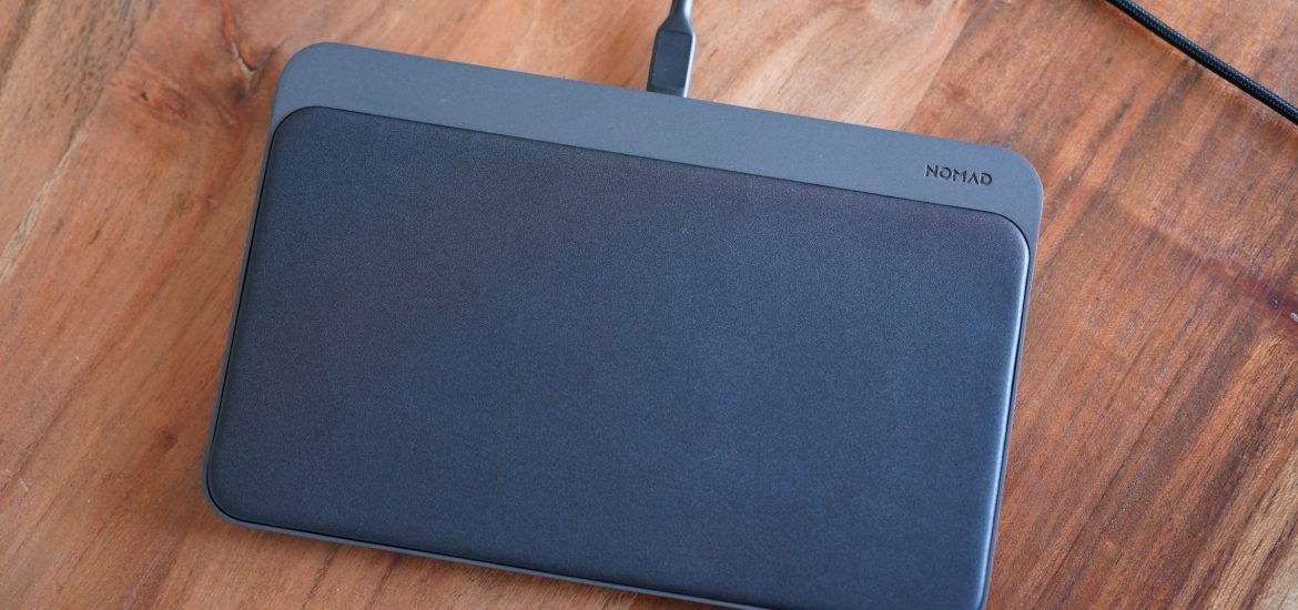
The Nomad Base Station Pro is just under 9 inches long, and about 5.5 inches wide. It’s less than half-an-inch thick, which is especially impressive, given that it has so much charging flexibility hidden within (there are 18 coils inside). As mentioned, it can support charging up to three devices simultaneously, and has an LED indicator on the side with three lights to let you know how many devices are actively drawing charge at any time. Nomad includes one USB-C to USB-C cable in the box, along with a 30w USB-C PD power adapter to connect it.

There are plenty of multi-device wireless chargers out there (Nomad even makes a few) but the real advantage that Aira’s FreePower tech brings to the table is the freedom to place devices on the pad in virtually any orientation and have them automatically charge. Most Qi chargers require you to place devices within a very specific range of area relative to the coil or coils contained within the charger — and being off by even a bit can either cause a device not to charge, or make the charging process much less efficient.

Design and performance

The Nomad Base Station Pro is larger than most wireless chargers out there, but all that surface area is usable space. And Nomad’s signature dark metal and leather finishes are both attractive and practical here. With its single-cable design, this is a much less cluttered and more physically attractive solution to charging than a mess of cables and a multi-USB adapter, for instance.

Inside, Aira’s technology is the beating heart of the Nomad Base Station Pro. There are 18 overlapping coils contained with the charger, along with a layer of controllers on a circuit board that provide the smarts that make its position-free placement charging possible. Basically, Aira’s technology automatically detects what kind of charge any device placed on the pad can accept, and then directs the necessary juice its way, while also optimizing the magnetic field between the device’s built-in charging coil and the coil array found within the Base Station Pro for optimal power delivery.

In testing, it worked just as advertised, detecting my iPhone XS Pro Max no matter what orientation or where I lay it on the pad (provided the phone’s own coil was fully on the pad, of course). Ditto when I added a second iPhone, as well as AirPods Pro, and another set of wireless earbuds I have that feature a Qi-enabled charging case. You can even slide the iPhone along the surface of the pad and it will continue to charge, without losing the connection as the field tracks the device.

What’s ironic about this is that even though it feels like magic, it’s really what I had always imagined wireless charging would be like before I’d actually used any wireless charging devices. Current standard Qi-based charging is much more like having a slightly more convenient but still essentially fixed dock, whereas Aira’s FreePower tech truly allows you to toss down your device and have it charge reliably.

Bottom line

Image Credits: Darrell Etherington

There are some caveats to keep in mind with this tech: First, it’s not officially Qi-certified — but that’s only because there’s no current existing standard for free position, according to the company. They’ve done extensive testing to confirm that it adheres to Qi standards for compatibility, heat management and more, and Aira is working with the Wireless Power Consortium (WPC) that owns and manages the Qi standard to create a standard that covers free-position charging.

In testing, it works well, and charges Qi-enabled devices reliably, with the added convenience of allowing you to place them anywhere on the pad. That may not seem like a huge deal, but it vastly improves the experience. Add three-device support to that, and Nomad’s Base Station Pro quickly becomes a unique (if somewhat expensive) wireless charger that’s hard to beat.

Aira, meanwhile, has big plans for FreePower, which includes providing the tech to a number of partners across consumer and commercial markets. It’s easy to imagine how well this could work in situations like coffee shop counters that are fully wireless charging surfaces, for instance, or in cars with charging center consoles. The company has big plans, but if this debut is any indication, those should pay off with big advantages across daily life for consumers.

OLYMPUS DIGITAL CAMERA

Hey Apple, how about a MacBook SE?

Apple’s a hard company to like these days. Their glory days behind them, they have relentlessly pursued a misguided concept of optimization that has alienated their user base and compromised their products. A MacBook SE would go a long way toward smoothing the wake they’ve left behind them.

I was excited that this would be a possibility years ago when the iPhone SE came out. “Here,” I thought, “is a company that has come to recognize the value of its legacy products.”

Although the (old) SE is indeed the best phone Apple has ever made, it’s clear now that it was little more than a way to squeeze a bit more money out of some leftover components. (The new SE seems to serve the new purpose, but I’ve embraced it nevertheless as the old model is increasingly left behind in design decisions.)

That one of its most popular products was an accident should come as no surprise, since Apple doesn’t seem to know or care what its customers want. The last few years have seen it either copying its competitors or compromising usability to skim an extra millimeter or two off devices’ thickness.

Image Credits: TechCrunch

The philosophy of telling people what they should want is a longstanding one at Apple, but one that only works if you have someone who knows those people better than they know themselves. Apple seems to no longer have anyone like that, and so they have continued, like a car with no driver and no destination, to mindlessly chase the horizon.

Of course they’re not the only company doing so. Get big enough and cruise control is the safest option. You can go a long way without touching the wheel. But those of us along for the ride may eventually pipe up.

So here’s me piping up: Apple, I’d really love a MacBook SE. And I think a couple million others would, too.

The iPhone SE appealed to the surprisingly (to Apple) large group of people who dislikedthe direction iPhone design was headed. They disliked the new larger size, the shift away from TouchID and towards a creepy new authentication technique, the notch, the fragility, the lack of a headphone jack that made their device backwards-compatible out of the box with decades of hardware and software.

A MacBook SE would, in a similar way, appeal to the people who dislike the direction notebook design has progressed. They dislike the uncomfortable, difficult to service keyboard, the removal of the beloved and practical MagSafe, the decision to commit entirely to USB-C ports, the tacky and underutilized Touch Bar.

Image Credits: TechCrunch

These are people who know what they want and have no option to purchase it from a company that used to provide it. There’s a good trade in 2015-era MacBook Pros (pictured above) and Airs because they were the best notebooks Apple ever made.

To be clear, here’s what I imagine an SE would be: a 13-inch notebook with a MagSafe power connection, USB-C ports and a headphone jack on one side, plus one old-school USB-A, HDMI out, and an SD card reader on the other. Oh, and though I suppose it goes without saying, let’s just be clear: The old keyboard, please.

Obviously it’s a bit presumptuous of me to tell one of the world’s largest and most successful companies that they’re doing it wrong and I’ve got the answer. But I don’t mean to say they should abandon all forward momentum and experimentation. I just want them to throw a bone to those of us who don’t want to be their guinea pigs.

And yes, I hear you all out there — get a Pinebook! A ThinkPad! And so on. Listen, I’m not some kind of Mac-only elitist, especially since years ago their products stopped being worth the premium one always paid for them — and that premium has only increased. I build my own Windows PCs and like it. I just happen to prefer the synergy of Apple’s hardware and software in the notebook form factor. And it’s not just the aesthetic, though Windows is certainly ugly.

That’s why it’s so disappointing to me that Apple seems to have forgotten the reasons its laptops became legendary. Because those same reasons were impediments to Apple’s misguided idea of what it might call elegance. Thinness and “simplicity” at all costs — even when the thinness is imperceptible and the simplicity is strictly on the side of the computer itself, not in how the user interacts with it.

Image Credits: TechCrunch

Every owner of an “elegant” new Mac notebook I’ve met — and that’s most of my colleagues at TechCrunch — has to carry around a menagerie of dongles, or borrow them, in order to work effectively across generations and industries. Perhaps a USB-A port looks ugly next to a USB-C one, or the MagSafe connector disrupts the symmetry of the device, but it can’t be worse than the tentacular disaster I see whenever anyone has to do anything on a new Mac laptop but type.

It’s as if Apple made pocket knives, and transitioned over the years from making a Swiss Army knife to a folding knife to a ceramic fixed-blade. Yes, the latter is simpler, more elegant in a certain way. But it sure isn’t any help when you need to open a can or bottle of wine.

Funnily enough, I made the opposite complaint 7 years ago when I felt mobile phones were becoming overstuffed with features. Keep it simple, stupid!

But in a way it was the same problem, just a mirror image. In that case I felt that increasingly bloated Android phones had gone from doing a few things well to doing many things poorly — things no one asked them to do. The real problem isn’t simply too much or too little, but not having the option to choose how much or how little for oneself.

I’m disappointed with Apple because the approach that made their laptops attractive to me in the first place has gone by the wayside. Perhaps that’s just a difference in philosophy, but I feel confident I’m not some kind of extreme outlier. As Apple found when it launched the iPhone SE that there were millions of people who wanted what had come before, I think they will likewise find it so with a MacBook SE. Sure, it’ll eat into the sales of the newer, more “elegant” devices, but it’ll open and maintain a market of people who have held off buying a new device for years because they, like me, have been waiting for Apple to do right by them again.

So please, Apple, grant my wish. Oh, and if you want to guarantee a few extra sales, let me offer one last tip: rainbow logo.

Apple contends Epic’s ban was a ‘self-inflicted’ prelude to gaming the App Store

Apple has filed legal documents opposing Epic’s attempt to have itself reinstated in the iOS App Store, after having been kicked out last week for flouting its rules. Apple characterizes the entire thing as a “carefully orchestrated, multi-faceted campaign” aimed at circumventing — perhaps permanently — the 30% cut it demands for the privilege of doing business on iOS.

Epic last week slyly introduced a way to make in-app purchases in its popular game Fortnite without going through Apple. This is plainly against the rules, and Apple soon kicked the game, and the company’s other accounts, off the App Store. Obviously having anticipated this, Epic then published a parody of Apple’s famous 1984 ad, filed a lawsuit and began executing what Apple describes quite accurately as “a carefully orchestrated, multi-faceted campaign.”

In fact, as Apple notes in its challenge, Epic CEO Tim Sweeney emailed ahead of time to let Apple know what his company had planned. From Apple’s filing:

Around 2am on August 13, Mr. Sweeney of Epic wrote to Apple stating its intent to breach Epic’s agreements:
“Epic will no longer adhere to Apple’s payment processing restrictions.”

This was after months of attempts at negotiations in which, according to declarations from Apple’s Phil Schiller, Epic attempted to coax a “side letter” from Apple granting Epic special dispensation. This contradicts claims by Sweeney that Epic never asked for a special deal. From Schiller’s declaration:

Specifically, on June 30, 2020, Epic’s CEO Tim Sweeney wrote my colleagues and me an email asking for a “side letter” from Apple that would create a special deal for only Epic that would fundamentally change the way in which Epic offers apps on Apple’s iOS platform.

In this email, Mr. Sweeney expressly acknowledged that his proposed changes would be in direct breach of multiple terms of the agreements between Epic and Apple. Mr. Sweeney acknowledged that Epic could not implement its proposal unless the agreements between Epic and Apple were modified.

One prong of Epic’s assault was a request for courts to grant a “temporary restraining order,” or TRO, a legal procedure for use in emergencies where a party’s actions are unlawful, a suit to show their illegality is pending and likely to succeed, and those actions should be proactively reversed because they will cause “irreparable harm.”

If Epic’s request were to be successful, Apple would be forced to reinstate Fortnite and allow its in-game store to operate outside of the App Store’s rules. As you might imagine, this would be disastrous for Apple — not only would its rules have been deliberately ignored, but a court would have placed its imprimatur on the idea that those rules may even be illegal. So it is essential that Apple slap down this particular legal challenge quickly and comprehensively.

Apple’s filing challenges the TRO request on several grounds. First, it contends that there is no real “emergency” or “irreparable harm” because the entire situation was concocted and voluntarily initiated by Epic:

Having decided that it would rather enjoy the benefits of the App Store without paying for them, Epic has breached its contracts with Apple, using its own customers and Apple’s users as leverage.

But the “emergency” is entirely of Epic’s own making…it knew full well what would happen and, in so doing, has knowingly and purposefully created the harm to game players and developers it now asks the Court to step in and remedy.

Epic’s complaint that Apple banned its Unreal Engine accounts as well as Fortnite related ones, Apple notes, is not unusual, considering the accounts share tax IDs, emails and so on. It’s the same “user,” for their purposes. Apple also says it gave Epic ample warning and opportunity to correct its actions before a ban took place. (Apple, after all, makes a great deal of money from the app as well.)

Apple also questions the likelihood of Epic’s main lawsuit (independent of the TRO request) succeeding on its merits — namely that Apple is exercising monopoly power in its rent-collecting on the App Store:

[Epic’s] logic would make monopolies of Microsoft, Sony and Nintendo, just to name a few.

Epic’s antitrust theories, like its orchestrated campaign, are a transparent veneer for its effort to co-opt for itself the benefits of the App Store without paying or complying with important requirements that are critical to protect user safety, security,
and privacy.

Lastly Apple notes that there is no benefit to the public interest to providing the TRO — unlike if, for example, Apple’s actions had prevented emergency calls from working or the like, and there was a serious safety concern:

All of that alleged injury for which Epic improperly seeks emergency relief could disappear tomorrow if Epic cured its breach…All of this can happen without any intervention of the Court or expenditure of judicial resources. And Epic would be free to pursue its primary lawsuit.

Although Apple eschews speculating further in its filings, one source close to the matter suggested that it is of paramount importance to that company to avoid the possibility of Epic or anyone else establishing their own independent app stores on iOS. A legal precedent would go a long way toward clearing the way for such a thing, so this is potentially an existential threat for Apple’s long-toothed but extremely profitable business model.

The conflict with Epic is only the latest in a series going back years in which companies challenged Apple’s right to control and profit from what amounts to a totally separate marketplace.

Most recently Microsoft’s xCloud app was denied entry to the App Store because it amounted to a marketplace for games that Apple could not feasibly vet individually. Given this kind of functionality is very much the type of thing consumers want these days, the decision was not popular. Other developers, industries and platforms have challenged Apple on various fronts as well, to the point where the company has promised to create a formal process for challenging its rules.

But of course, even the rule-challenging process is bound by Apple’s rules.

You can read the full Apple filing below:

Epic v. Apple 4:20-cv-05640… by TechCrunch on Scribd

gravitymachine-concept

This looping aquatic treadmill lets tiny ocean creatures swim forever under the microscope

Observing the microscopic creatures that fill our oceans is important work, but keeping your eye on one in the wild is practically impossible — and doing so in a dish isn’t the same. This “hydrodynamic treadmill” however provides the best of both worlds: An unending water column for the creatures to swim in, without ever leaving the watchful eye of an automated microscope.

The Gravity Machine, as it’s called, is the brainchild of Stanford researchers under bioengineering professor Manu Prakash. He and some students, during a research trip to Madagascar, had built a slightly clunky meter-long tube with an attached microscope that could follow a creature as it moved up and down. But these microorganisms sometimes travel hundreds of meters a day to chase the sun or nutrients in the water.

“We haven’t had the opportunity to observe this life in its own habitat … the last 200 years, we’ve been doing microscopy with confinement. You’d have to have a kilometer-long tube if you wanted to track an organism over a kilometer,” Prakash said. “While we were thinking about this problem, it dawned on us — there was this ‘aha!’ moment where we thought, instead of a long tube, what if the two ends of the tube were connected?”

Image Credits: Stanford University

The gadget is, in retrospect, almost obvious. Instead of having a microscope pointing downward at a dish where the creatures swim around in a shallow pool of water — nothing like their natural environment — you have one pointed sideways at a closed glass loop filled with water and the organisms of interest. They can swim freely up and down, and as they do so the loop slowly spins to keep them within the frame of the microscope.

A computer vision system attached to the 3D microscope carefully tracks the location of the target creature and keeps it in focus, while auxiliary systems note the exact distances traveled and other metrics.

The team has used the device to capture all manner of beautiful and scientifically interesting behaviors by microscopic organisms.

“It’s fair to say that every time we have put an organism into this instrument, we have discovered something new,” Prakash said.

One such novelty is the fact — obvious upon inspecting these creatures in this way — that despite living in a fluid environment and at a scale of microns, gravity is a major factor in their lives. “They’re all aware of gravity, and they all care about gravity,” said Prakash. Exactly how would be very difficult to say until the creation of this machine, which lets the scientists observe these behaviors directly — hence the name.

Image Credits: Stanford University

Image Credits: Stanford University

The imagery produced by the instrument is visually arresting and interesting even to a layperson, as well — and capturing the interest of the general public is remarkably difficult to do when it comes to the field of marine microbiology. People’s eyes tend to glaze over when you talk about the diurnal migratory habits of dinoflagellates, but seeing one of these beautiful creatures up close and in focus, doing what it does best (whatever that is), is simply fascinating.

While the water stays in the loop (ideally — “we do explode wheels in our lab,” noted Prakash) that doesn’t mean that it’s a totally closed system.

“We can introduce things based on what the creature is doing,” said grad student Deepak Krishnamurthy. “We can introduce nutrients, tie the light intensity to it —  it’s a feedback loop between the organism and its environment. We’re also working on doing that with pressure, temperature and other aspects of the ocean.”

I couldn’t shake the idea that I’d seen something like this before, and well into development of the Gravity Machine, Prakash himself came across a similar idea from the ’50s, a much larger loop that a marine biologist named Hardy used to allow jellies to swim endlessly in a similar fashion. Of course the present device could only happen with the advance machine learning and robotics tech that we have today, but as Prakash said, “the historic context is quite beautiful, actually. We got a big kick out of that in the lab.”

Stanford’s Gravity Machine wasn’t quite the first, then, and the team means to make sure it isn’t the last, either, by publishing all the details on how to build and run the instrument.

“We were careful to make it as open as possible, and that affected our choices of hardware and software,” said Krishnamurthy. “The intention is for it to be completely open-source for research purposes. We use open-source algorithms for tracking, we wrote our own for the controls that keep it in focus, the UI for watching and collecting data.”

“We’ll be putting instructions for people to build this on the gravitymachine.org site itself,” added Prakash. An ordinary microscope can be used with some modification and a few easy-to-get parts, and ultimately it’s no more than a lab might do to create or customize its own equipment anyway. He even hinted at a “home edition” that could show a curious user what critters in the endless water column were up to. Sort of like having your sea monkeys live on TV.

The exact specifications of the Gravity Machine will be published soon, as will the team’s first paper using the device to discover something new and extremely weird: diatoms that can voluntarily control their own density to rise or fall in the water column. You can read more about the device at its site or this Stanford news post.

Oura-Ring-2

The Oura Ring is the personal health tracking device to beat in 2020

The Oura Ring has been getting a lot of attention lately because of its role in a number of COVID-19 studies, as well as its adoption by both the NBA and WNBA as a potential tool for helping prevent any outbreaks of the novel coronavirus as those two leagues get back to a regular schedule of play. Oura has released multiple generations of the Ring, which is a health and fitness tracker that reports a range of data, and I’ve spent the past month using one to see what all the fuss is about.

The basics

The Oura Ring is a health tracker that’s unlike just about any other wearable with a similar purpose. It’s a ring that’s virtually indistinguishable from an actual ring without any smart features, available in a couple of different designs and multiple finishes. The Ring has sensors located on the inside surface, but these barely add to its overall thickness and are totally hidden when the ring is worn.

Despite its small size and low profile, the Oura Ring is still a connected device, with an internal battery, and the ability to talk to a smartphone via Bluetooth to transmit the data its sensors collect. In the box, you also get a USB-C stand for the Oura Ring that powers it up via induction charging.

The built-in battery is good for up to seven days of continuous use — and that includes wearing the Oura Ring during sleep. During my usage, that seemed to be an accurate estimate. In general, though, the battery life just seemed to be “long enough,” prompting me not to really think about specific spans, and charging is so quick that it’s easy to just remember to put it on the dock occasionally when it’s convenient (I would often do this during the work day while at my desk, where I keep the Oura dock). Oura’s app also sends helpful notifications to remind you to charge before bed when you’re getting close to the end of your ring’s battery life.

Design

Oura’s design for this most recent iteration of their Ring is fantastic — both as just a piece of jewelry and doubly so as a connected health and activity tracker. It’s available in two styles, called “Balance” and “Heritage,” both of which come in multiple metallic finishes. There’s a polished silver and gloss black option for both, while “Balance” has a premium-priced version with inlaid diamonds, and “Heritage” has a matte black finish option (which I reviewed).

Image Credits: Darrell Etherington

All the various finishes ore made of a lightweight titanium, with a molded plastic inner to protect the sensors and provide transparency for them to work. The exterior finishes are all coated with a scratch-resistant outer layer — but like with just about any other metal jewelry, scratch-resistant isn’t scratch-proof. The matte black finish I reviewed is definitely showing some wear and tear after multiple weeks of use, but that’s something I was fully expecting, and it’s surprisingly resilient, given how often it comes in contact with other metal surfaces, stone and whatever else you come in contact with on a daily basis. The minor blemishes that appear lend it a pleasing patina, rather than negatively impacting its aesthetics, in my opinion.

The Oura Ring is also fixed in terms of sizing and fit, and the company has come up with a clever way to handle ensuring a good fit for customers. They offer a free sizing kit that they ship out first so you can figure out which Oura size is most comfortable, and decide on which finger you want to wear it. Size is important because you want the Oura Ring to fit snugly enough that it won’t fall off or shift around too much, but also not too snugly that it becomes uncomfortable.

Ultimately, the design is fantastic because it’s both an attractive ring, and an incredibly comfortable device to wear all day — and through the night. Unlike even an Apple Watch or other wrist-worn wearable, there’s virtually no adjustment required for getting used to wearing it while sleeping, or any discomfort from various types of bands. It’s the first wearable I’ve used where I truly was able to forget that I was wearing one at all, and it’s one that no one else will realize you’re wearing, either.

Features and performance

So what does the Oura Ring actually track? A lot of things, actually. It measures sleep, as mentioned, as well as various other metrics under two broad categories: Readiness and Activity. Sleep, Readiness and Activity all provide one overall summary score out of 100 to give you a topline sense of where you are, but each is actually calculated from a range of sub-metrics that add up to that larger score.

Oura’s sleep tracking is much more in-depth than the forthcoming Apple Watch sleep tracking that Apple is releasing with its next watchOS update in the fall. It monitors when you go to sleep, how long you sleep, how much of that qualifies as “deep” and how much is “REM,” and gives you a metric or you sleep efficiency, your time in bed, your total sleep time and more. Readiness tracks your ambient body temperature, heart rate variability, respiratory rate and your resting heart rate, while activity automatically measures calorie burn, inactive time, your steps and how close you are to your overall activity goal.

Image Credits: Darrell Etherington

For all three of these categories, you can dive into each individual sub-metric and see trends over time or individual scores per day, but you also can just look at the overall score, which is provided in a feed-like dashboard in the app and accompanied by practical, actionable advise about what to do with your day, your activity or your sleep habits based on that score and how it’s trending.

It’s at once both the easiest to understand health tracking app I’ve used, and also one of those with the most depth when it comes to digging into what is actually being tracked, and what that means in greater detail. And because the app focuses heavily on establishing a baseline and then monitoring deviations from that baseline and providing advice based on that, it’s more likely to be useful and specifically relevant to you.

Bottom line

With most wearable tech, including the Apple Watch, I periodically have a sort of internal revolt where I end up finding them too much of an intrusion, or too much of a hassle to maintain continuous use. With the Oura Ring, health self-monitoring reaches a perfect pinnacle of combining convenience with useful and actionable information, with an unobtrusive and attractive design that actually makes me want to put it on.

The jury remains out on whether the Oura Ring can actually accurately detect COVID-19 or anticipate the onset of its symptoms, but regardless, it’s a fantastic personal health tracking device and a great tool for anyone looking to take more control over how they feel on a daily basis. And by actively establishing an individual baseline and comparing your actual overall state to that every day, Oura provides one of the best potential platforms for long-term personal wellness insight out there.

Philips-Hue-Play-HDMI-Sync-Box-Ambilight-over-hue-lamps

The Philips Hue Play HDMI Sync Box makes any home theater a bit more theatrical

Signify has steadily expanded its Hue line of smart lighting products to cover the entire home, inside and out. But while the ability to remotely control your lighting, including adjusting color, intensity and brightness is great, one of its more recent products focuses more on how to turn all those connected lights into a dynamic, at-home interactive entertainment experience. The Philips Hue Play HDMI Sync Box is a relatively simple device that sits between your video sources, including things like game consoles and the Apple TV, and your television, enabling synced light shows that can take advantage of a wide range of Hue products.

The basics

The Hue Play HDMI Sync Box is at its core an HDMI switcher, offering four HDMI inputs and a single HDMI output. Signals from your input devices (e.g., Apple TV, Roku, Xbox, PS4, etc.) go into the box and are passed through to the TV, with switching happening automatically depending on which device was most recently active (you can also change them manually with the app and with voice controls).

The Sync Box supports a range of modern quality standards for display and audio. It supports 4K 60Hz resolution, HDR10+ and Dolby Vision standards, as well as Dolby Atmos surround sound. It also supports HDMI 2.0b with HDCP 2.2 compliance for copyright protection.

You will need not only Hue colored lights, but also a Hue Bridge (the second-generation, rounded-square version) to ensure that the Hue Sync Box is more than just a particularly expensive HDMI hub, but it does that job very well, too. If you do have Hue products, like the Hue Play light bars that can easily mount on top of your TV stand or to the back of your TV itself, or the Hue Signe multicolored floor or table lamps, then you can use the Sync companion app to ensure your lights reflect what’s going on on screen — for any video that plays through the box from any source.

Image Credits: Philips

Design and performance

Why would you want this? Well, mostly because it looks really, really cool. Hue Sync has already been available as a software feature for you to use with video played back on Macs and PCs when used in combination with a monitoring tool. But that has a lot of limitations, including not being able to work with official Netflix apps and Netflix in the browser. The Sync Box eliminates any potential roadblocks and also means you can use regular streaming and gaming sources without having to run a media center PC.

The box itself is relatively large, but that seems like it’s mostly to accommodate the multiple HDMI ports. It’s very short, despite being about twice the surface area of an Apple TV, so it should be very easy to integrate into your existing home theatre setup, whatever that entails.

Setting up the Hue Play HDMI Sync Box is very easy and requires only installing the app and pressing the sync button on your Hue Bridge when instructed to do so. As mentioned, you can plug in up to four sources and the box will switch between them automatically when you use an input device or you can also manually change the input (and rename them) using the app. The app also allows you to tweak the intensity, brightness and responsiveness of the light, making it more subtle or more extreme, depending on your preferences and your activity. A “Game” setting, for instance, sets it to maximum intensity and responsiveness for a more dynamic effect befitting fast-paced interactive content.

Image Credits: Philips Hue

I found that the lighting was extremely good at mimicking the colors and brightness of a scene, especially if you take the time to accurately set up the position of your Hue lights for a dedicated “entertainment area” in the official main Hue app. It’s an effect that, when used in its most subtle settings, can basically fade away but still provide genuine enhancement for the watching experience, making it feel more immersive. At its maxed out settings, it’s much more noticeable, but still something that basically fades away into the background over an extended period of use, in a good way.

Especially since the firmware update, the Hue Play Sync Box has proven a fantastic addition to my home theater setup, providing an extra bit of flair to every TV watching experience. It’s obviously more effective in dark rooms, but it really seems to especially complement high-quality OLED screens that produce vibrant colors and true, deep blacks.

Bottom line

The Hue Play HDMI Sync Box is a bit of an extravagance at $229.99, but it definitely adds to the overall home TV-watching experience, for movies, streaming and for gaming. The four HDMI inputs mean you can also use it to add more ports to your TV, if that’s something you need, and the recent updates mean you’re not going to sacrifice any video quality while doing so.